Real-Time Dashboards Are Lying to You: The Blind Spots Built Into Speed
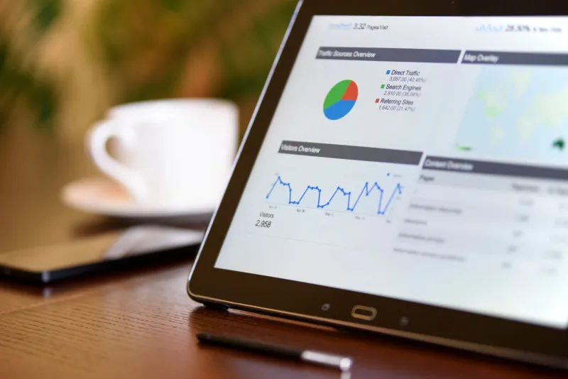
There is a seductive logic to real-time analytics. The idea that a business can observe itself as it breathes — watching transactions process, campaigns convert, and inventory shift in the span of seconds — feels like the ultimate expression of operational control. For many executives, a live dashboard has become the modern equivalent of standing on the factory floor. It signals engagement. It signals rigor.
But there is a problem with this picture, and it is one that the analytics industry rarely advertises: speed, pursued without discipline, can quietly corrupt the quality of your decisions.
The Recency Trap
Cognitive scientists have long documented humanity's tendency to over-weight recent information. In behavioral economics, this is sometimes called recency bias — the instinct to treat the most current data point as the most meaningful one. Real-time dashboards, for all their technological sophistication, are essentially recency bias machines. They are engineered to surface what is happening right now, and in doing so, they can crowd out questions about what has been happening over weeks, quarters, or years.
Consider the experience of a regional retail chain operating across the Midwest that invested heavily in real-time point-of-sale analytics. Their operations team monitored hourly sales figures with remarkable precision. When a particular product category showed a dip on a Tuesday afternoon, they responded quickly — adjusting promotions, reallocating floor staff, and flagging the issue in their weekly stand-up. The system worked exactly as designed.
What the real-time view failed to surface was a 14-month gradual erosion in average basket size among their 35-to-50-year-old customer segment. The shift was too slow and too diffuse to register as an alert. It was only when a quarterly cohort analysis was finally commissioned — the kind of slower, deliberate analytical work that had been deprioritized in favor of live monitoring — that the pattern became visible. By that point, the company had lost meaningful ground to a competitor that had quietly repositioned around that demographic.
The dashboard had been accurate. It simply had not been sufficient.
When Noise Drowns Out Signal
Real-time data streams are inherently noisy. Any sufficiently granular data feed will contain fluctuations that mean nothing at all — random variation, technical anomalies, seasonal micro-patterns that cancel themselves out within hours. The challenge for organizations is that the human brain is not well-suited to distinguishing meaningful signal from statistical noise, particularly when that noise is presented with the visual authority of a polished interface.
Analytics practitioners sometimes refer to this as "dashboard theater" — the performance of data-driven decision-making that is, in practice, a series of reactions to noise. Teams that check their dashboards every fifteen minutes are not necessarily more informed than teams that review structured weekly reports. In many cases, they are simply more reactive, which is a different thing entirely.
A B2B software company based in Austin discovered this dynamic the hard way. Their customer success team had built an elaborate real-time churn risk model that flagged accounts based on login frequency, feature adoption, and support ticket volume. The model was technically impressive. It was also generating so many alerts that the team became desensitized to them — a phenomenon well-documented in fields ranging from hospital monitoring to financial trading. High-priority warnings blurred into background noise. Genuine at-risk accounts were missed not because the data was absent, but because the signal-to-noise ratio had collapsed.
The team's eventual solution was counterintuitive: they deliberately slowed down their monitoring cadence for most accounts, reserving real-time alerts for a narrow set of high-confidence indicators. Response times to genuine churn signals actually improved once the volume of false urgency was removed.
The Missing Middle: Trend Layers That Live Between Real-Time and Annual
One of the least-discussed gaps in many organizations' analytics architecture is the middle temporal layer — the weekly, biweekly, and monthly trend analyses that sit between moment-to-moment dashboards and annual strategic reviews. This is precisely where many of the most consequential business patterns live.
Customer sentiment shifts, competitive pricing movements, workforce productivity trends, and supply chain stress signals tend to accumulate over weeks and months. They rarely announce themselves in a single data point. Organizations that have optimized their analytics infrastructure for the extremes — real-time operational monitoring on one end, annual planning cycles on the other — frequently have no systematic mechanism for detecting these mid-tempo signals.
Building that middle layer requires deliberate investment. It means designating analytical workflows that are explicitly designed to surface patterns across 30, 60, and 90-day windows. It means training decision-makers to sit with trend data that does not demand an immediate response. And it means resisting the institutional pressure to treat every analytical output as an action trigger.
Rebalancing the Analytics Portfolio
None of this is an argument against real-time analytics. There are genuine operational contexts — fraud detection, logistics routing, live e-commerce personalization — where low-latency data is not merely useful but essential. The argument, rather, is for portfolio thinking.
Just as a sound financial strategy allocates across different asset classes, a sound analytics strategy allocates across different temporal horizons. Real-time monitoring handles the operational layer. Weekly and monthly trend analysis handles the tactical layer. Quarterly and annual pattern recognition handles the strategic layer. Each serves a distinct purpose, and none should cannibalize the others.
The companies that have navigated this balance most effectively tend to share a common trait: they are explicit about which analytical outputs are meant to inform action and which are meant to inform understanding. Those are different cognitive modes, and conflating them is where much of the damage occurs.
Speed is a tool. Like any tool, its value depends entirely on whether it is matched to the right task. The next time your team gathers around a live dashboard, it is worth asking not just what the data shows — but what, by design, it cannot.